Case study
Vela Design System
How Vela moved from inconsistent UI to a production-grade design system in 72 hours
Vela is a data-heavy fintech platform where shipping speed was creating UI debt across the product.
Instead of a long discovery phase, I embedded directly into their workflow and shipped a production-ready system foundation in 72 hours, including designtoken architecture, React component system, reusable UI primitives, and a Figma-to-code alignment layer.
72 hours
From zero to a deployed, documented core system in React + Tailwind.
Continuous Scaling
What began as 8 components evolved into a full system supporting complex financial dashboards and SME workflows.
Zero-Drift Engineering
A shared design-to-code system where Figma and production evolve together, preventing UI drift and maintaining consistency at scale.
The company
Vela is a fintech platform helping freelancers and SMEs manage their investments and financial portfolios. The product is web-based, data-heavy, and used daily for real financial decisions, where clarity and trust directly impact user confidence.
The problem
Vela's engineering team was shipping fast, but without a shared system for UI decisions.
Components were inconsistent across surfaces. Colors were hardcoded. Dark mode didn't exist. And every new feature required design and engineering to repeatedly re-interpret spacing, color, and interaction patterns.
Over time, the interface wasn't breaking visually — but it was becoming expensive to evolve. Every sprint introduced small inconsistencies that accumulated into system-level debt.
The approach
I embedded as a product systems operator inside the team and took ownership of the design-to-code system — from architecture through to production implementation.
Instead of running a long discovery phase, I focused on one constraint: build a production-grade system foundation in 72 hours that could immediately be used by engineering.
The goal was not to document UI decisions, but to eliminate ambiguity between design intent and implementation entirely.
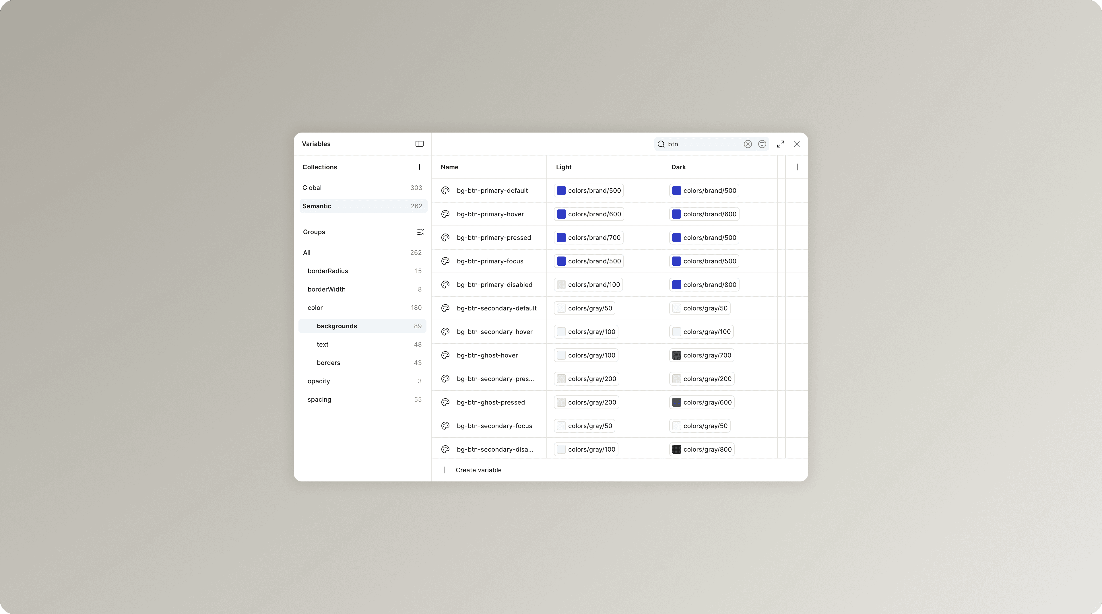
Token architecture
I defined a two-layer token architecture designed to remove ambiguity between design and code at scale.
Global
Primitive values: color, spacing, radius, type scale. These are never consumed directly by components.
Semantic
Contextual tokens that map meaning onto primitives. For example, bg-btn-primary-hover resolves to a brand primitive, not a raw value.
Components only consume semantic tokens, which means visual decisions are abstracted away from implementation details.
This structure makes system-wide changes deterministic. Updating a brand color becomes a single change at the global layer, automatically propagating through all components and themes, including dark mode.
In code, the same architecture is mirrored using Tailwind v4's `@theme {}` system, with CSS variables representing both layers. No config duplication. No separate token sources. No drift between design and production.
Component system
8 core components, each built with all states covered:
- Button — Primary, Secondary, Danger, Ghost × Default / Hover / Pressed / Disabled / Loading
- Input — Default / Focus / Filled / Error / Disabled, with label and helper text
- Badge — Primary, Secondary, Destructive, Success, On Hold × with and without close action
- Alert — Error, Info, Success, Warning
- Link — with semantic color states
- Dropdown / Combobox — with search and multi-select
- Card — Metric, Summary, Empty state
- Navigation item — Default, Hover, Active
Every component uses only Semantic tokens. No hardcoded values anywhere.
The Figma → code bridge
This is where most design systems break down. Our pipeline:
- Variables exported from Figma using the Export Variables plugin
- Semantic token layer maps directly to CSS custom properties
- Tailwind v4 consumes those properties — no config file needed
- Components reference Tailwind utility classes that point to semantic tokens
- Dark mode works by swapping the `.dark` class on the root — zero component changes required
The result: when a token changes in Figma, it's exported, pasted into `index.css`, pushed to GitHub, and Vercel deploys. The component code doesn't change.
Storybook as the execution layer
Every component is documented in Storybook with all variants and states visible, interactive controls to toggle props, and a dark mode toggle. Deployed publicly and linked from the team's internal docs.
Engineers stopped asking designers what a disabled state should look like. They opened Storybook and found it.
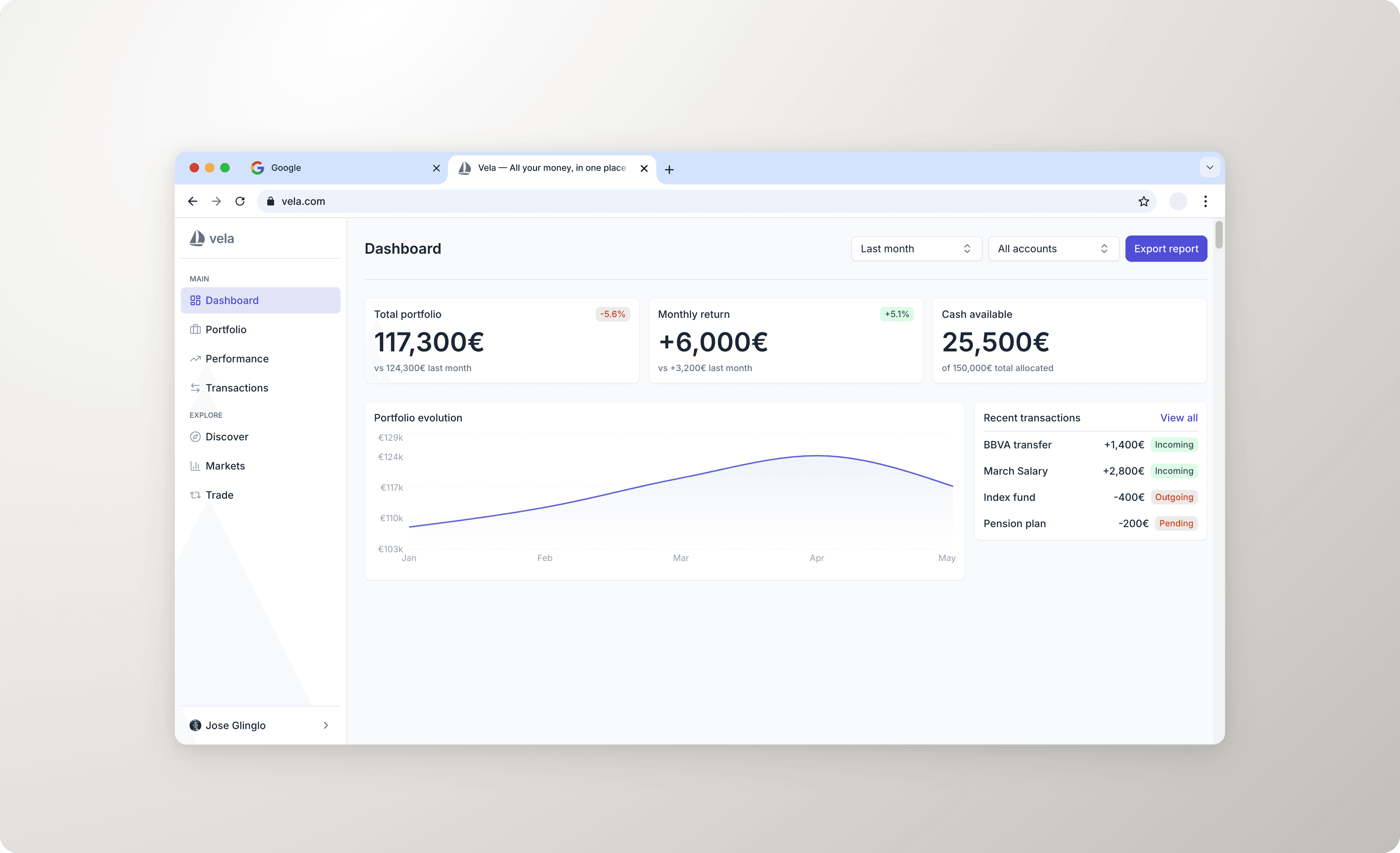
The product in action
To validate the system against a real product surface, we built Vela's main dashboard using only system components — no one-off styles, no exceptions.
The dashboard includes sidebar navigation, metric cards for portfolio value, returns and active investments, a recent transactions table with semantic badges, and empty states for sections with no data yet.
Built in React + Tailwind, deployed on Vercel. Light and dark mode work out of the box.
What changed for the team
Shipped faster, without cutting corners.
Tokens defined once in Figma propagate to every component in code automatically. When a value changes, nothing breaks — because nothing is hardcoded. The system removes the friction that slows teams down, not the quality.
No more handoff meetings.
Engineers stopped interpreting Figma files. They opened Storybook, found the component, toggled the state they needed, and copied the props. Fewer questions. Fewer mismatches. Fewer meetings.
Consistent UX across the entire product, automatically.
Consistency stopped being a convention enforced by code review and became a structural property of the system. A new engineer can't accidentally use the wrong shade of blue — because the wrong shade of blue doesn't exist.
Brand changes in minutes, not sprints.
The two-layer token structure means rebranding — or adapting the system to a new product line — is a Global layer update. Components don't change.
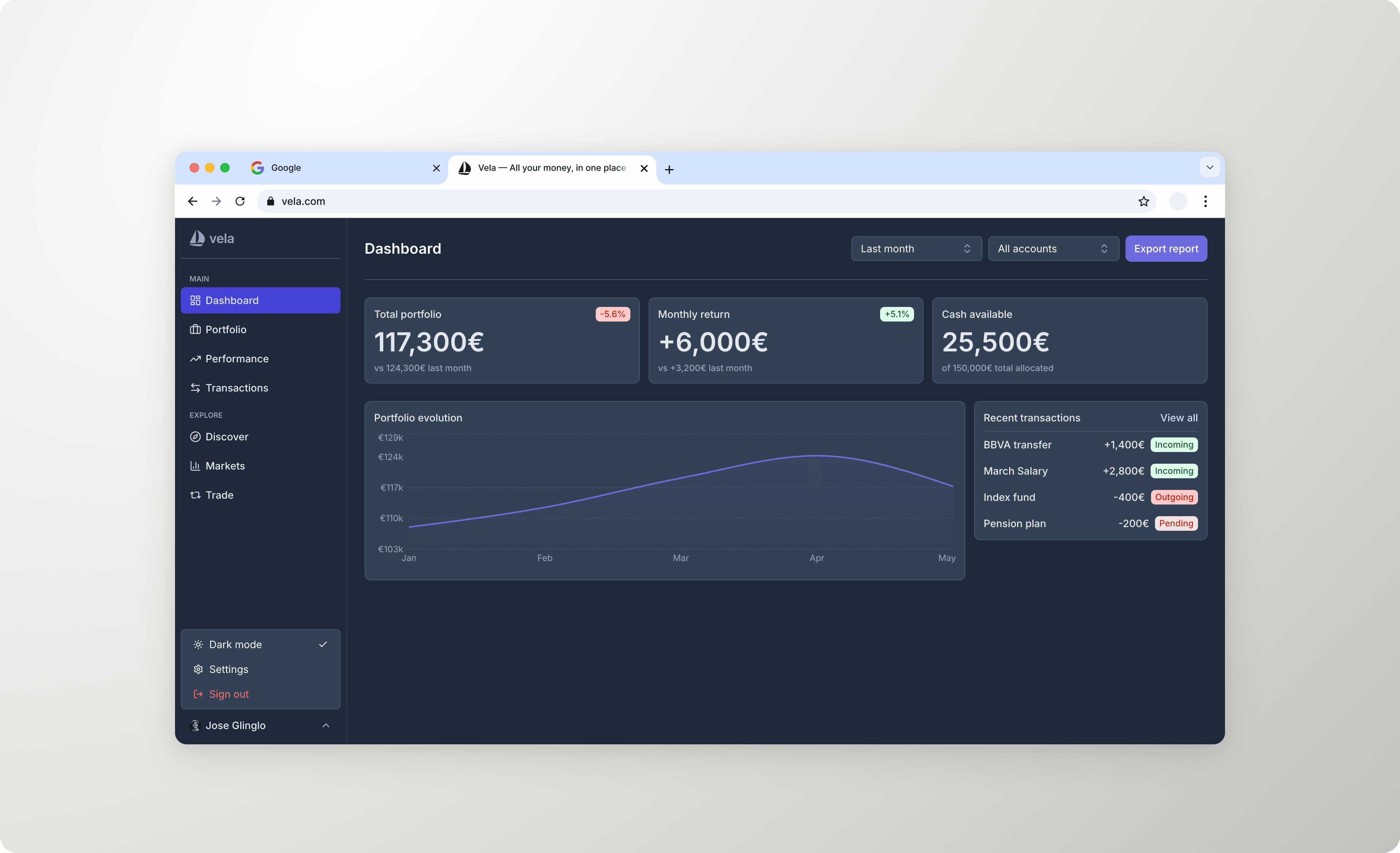
Dark mode and theming at zero cost.
Because components only reference semantic tokens, dark mode is a single class swap on the root. No per-component overrides. No duplicated stylesheets.
WCAG AA compliance built in, not bolted on.
Accessibility was addressed at the component level during construction — not as a separate audit phase. Color contrast, focus states, and interaction patterns meet WCAG AA requirements across all components. When engineers use the system, they get accessible UI by default. Compliance isn't a task on the backlog — it's a property of the architecture.
Prototypes in minutes, not days.
With the system live in code, new ideas can be validated in a working prototype before any engineering time is committed. Components are already built — assembling a new screen is a matter of composing what exists. Presenting a new feature direction to stakeholders went from a Figma mockup to a live, interactive URL.
AI-assisted workflows cut build time significantly.
The system was built using Claude Code and Figma MCP. Token export, component scaffolding, and design iteration were all AI-assisted. That workflow is documented, repeatable, and teachable to any team that wants to move faster without adding headcount.
Stack
- Design
- Figma (variables, auto layout, component variants)
- Frontend
- React + TypeScript + Vite
- Styling
- Tailwind CSS v4
- Documentation
- Storybook 8
- Deployment
- Vercel + GitHub
Timeline
| Day | Work |
|---|---|
| 1 | Token architecture in Figma (Global + Semantic), palette, typography |
| 2 | 8 core components in Figma + code, Storybook setup |
| 3 | Dashboard mockup in React, deployment, documentation |